First book in file 1, photograph courtesy of Stewart Clements
Dick Bruna and Black Bears and Japanese Matchboxes, the second show at the Katherine Small Gallery, offers an entrance into the career of a prolific book designer. And set in two glossy, white flat filing cabinets you pull open to explore drawer by drawer, it’s the kind of exhibit that demands participation.
It’s an accessible approach—once you’re inside.
Michael Russem, gallery owner and the exhibit’s curator, watches people linger at the window, looking interested. “They’re afraid to come in,” he explains, regretfully. The design of the storefront is impressive, perhaps intimidating with its freshly painted grey exterior and red trim framing an equally considered interior. But the gallery, on Beacon Street in Somerville between supermarkets and restaurants, really demands little more than the space’s previous occupant: a specialty flower shop known for the floppy-eared rabbits who roamed the store and slept in the window. In 2017, Russem took it over, bringing in his rare books, stamps, and other ephemera and giving us all another beautiful excuse to break up the grocery run.
The room is sparse yet inviting, a designer’s space. It’s very clean, divvied into nooks and corners for art exhibitions and bookshelf browsing. Before the door closes behind you, Russum is offering words of welcome. “This is not a place for everyone,” Russem says, “but I want everyone to feel comfortable.”
He suggests starting the exhibition with the flat file to the right.
Approaching the first set of stacked metal drawers, you are welcomed into the exhibit by its clever top: a plexiglass viewing box, as though a file drawer were left permanently open. The contents can only be viewed up close.
While you may not have a clue what Dick Bruna has to do with bears and matchboxes, you are no doubt familiar with his books for children—the childlike oversized faces of Miffy the bunny and friends gallivanting at the park. These books are wildly popular in Japan, as we learn from a brief essay by Russem placed elegantly at the back of the exhibit catalog.
In this first viewing window, Bruna’s iconic Miffy greets you without a smile—an X forms the stitch of her nose and mouth. Three of five slim, square books lie open: Miffy hides, digs, and seesaws with her friends. The scenes are cute if somehow sad, simple and yet emotionally complex.
But Bruna was more than a children’s book illustrator. He designed thousands of novels for his family’s publishing house, Zwarte Beertjes—Black Bears—which is why alongside the first look at Miffy are three narrow books by Ian Fleming, Leslie Charteris, and Jean-Paul Sartre. The Miffy books are in a distinctly Northern European palette of primary red, yellow, blue, and green; the books for adults form a contrastingly grown-up column of softcovers in black and gray, white, and teal. All show the same sophisticated, layered sense of humor and design.
The gallery measures up.
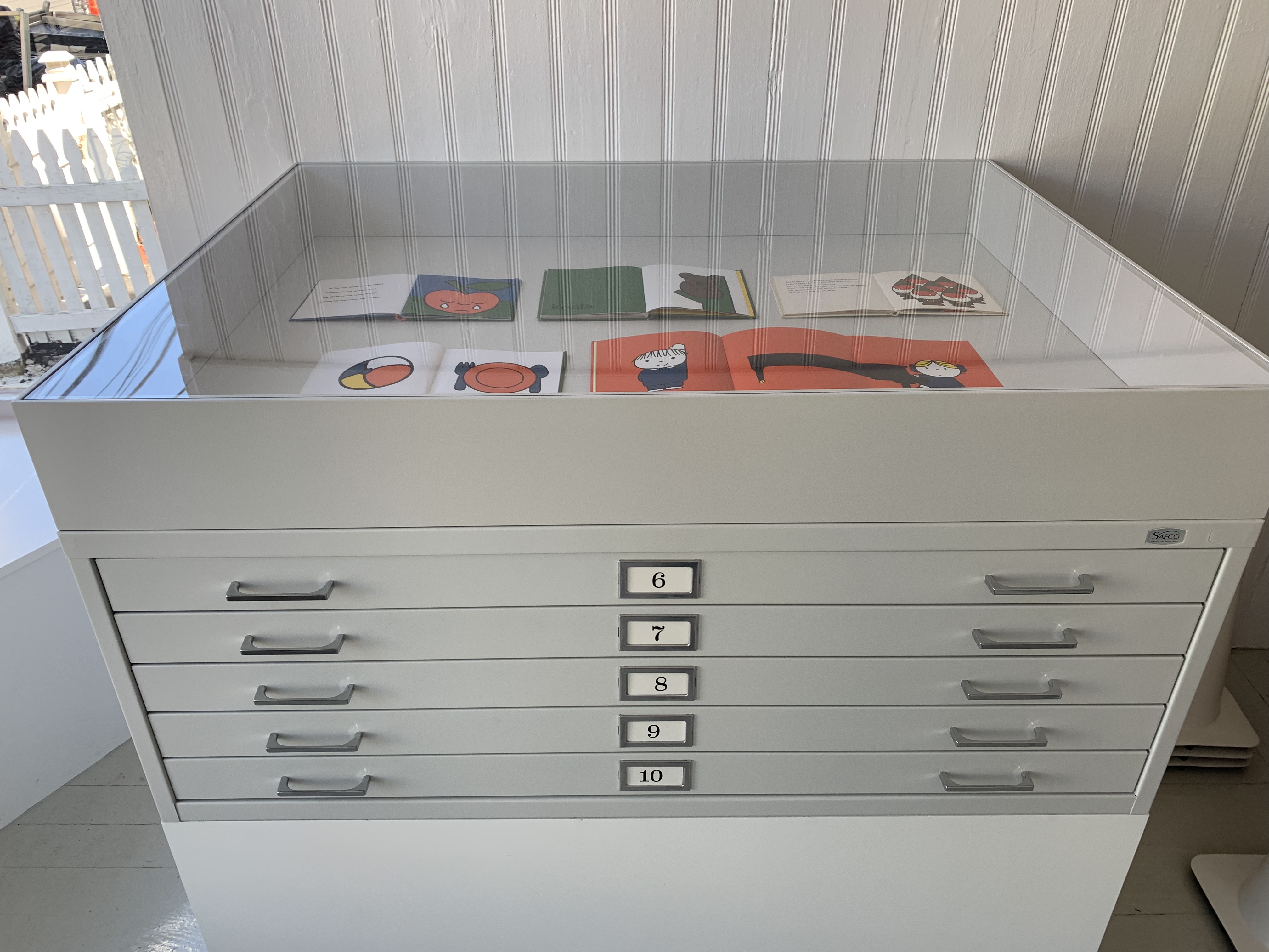
Second file cabinet
Pull a drawer marked with a simple serifed number 1 into the light and a row of book covers appears, placed spaciously above a row of four matchboxes. Each matchbox is paired with a book; each book has its matchbox. The books are all vertically oriented and more or less the same dimensions, while the matchboxes alternate—vertical, horizontal, rectangle, square. This is the format for the remaining nine flat file drawers, their common layout a key element of Russem’s smart, engaging curation. Schooled in the history as well as the contemporary landscape of book design, Russem is not shy about his ambition. “Design is not just about getting people to buy more junk,” he asserts. “It’s about attention and communication, making connections that help us to see.”
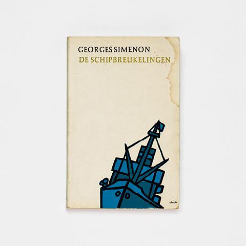
In layout Zero, close-ups predominate; the changing landscape fills the arrangement in file 1. Dashing fuschia, orange, lemon, and lime and a painterly, collaged aesthetic take off from the primary palette and planographic feel of the children’s books. To start, a cerulean-patchwork ship sinks on—or off—the cover of De Schipbreukelingen (1967) by Belgian author Georges Joseph Christian Simenon, whose Inspector Maigret may be known by name. The colorless sky in the distance resembles an unprimed and duly stained canvas, as does the “ground” of the matchbox below. The cover of Simenon’s Stoplicht (1964) itself becomes a stoplight—red, orange, and green circles stack up in the night-black bleed. The sun, a large cut-out, sets on De jeugd van Francesco Campana (1960) by Dutch poet Margo Sybranda Everdina Scharten-Antink.
Many of the book cover designs and book-matchbox pairings exhibit a capacity for improvisation often associated with jazz. On one colorful matchbox, the French horn appears like a stamp, or a snail, while an animated lizardesque S, umbrella tucked under one limb, dances across the frame In Memoriaum de Schaduw by Dutch writer, journalist, and translator Hendrikus Frederikus (Hans) van der Kallen (aka Havank, another writer largely known for mysteries). Silhouetted men in tipped hats and upturned collars stride alone or in single file across the remaining covers in the exhibition.
A naked woman in drawer 5 is paired with a matchbox decorated in a woodblock print of leaves along the spine of a Ginko tree. An arrow-like shape emblematic of a pine tree appears on the cover of the book, closer still to the woman, pointing its tip at her as she turns to look at us.
In fact, all the book covers and matchboxes displayed in file 5 are set against a background of deep, glowing green, which picks up on the grass in Miffy’s yard. Preceding and following this file are other files curated around shades of blue, red, pink, black and white, and rainbow. Each color scheme appears to riff on the previous one and echoes themes across the show.
And each file delivers a surprise visitor—Jane Avril, French can-can dancer made famous by Henri de Toulouse-Lautrec, graces the cover of Jane Avril van de Moulin Rouge (1960), a translation of Miss Jose Shercliff’s 1952 biography of the dancer. Niet door water maar door vuur (1965), a translation of James Baldwin’s The Fire Next Time (1963), includes a characteristically forceful, furrowed if informal photograph of the beloved writer. In a classic Hollywood image of Boris Karloff in 1931, Frankenstein’s monster hangs his broad shoulders in the mix. The shot appears on the cover of Het monster van Frankenstein (1968), a translation of Mary Shelley’s novel of 1818.

Second top case and file 6
Spanning the ages, these figures are filmic, literary, and conceptually rich, but the purely visual material in the show is equally rewarding. For instance, the planes created by the edges of the pages are bound to grab your attention, especially in Slalom met de dood (1971) by Ted Viking, Dolle Meimand (1964) by Richard Gordon, and Het raadsel van de drie gestalten (1961) by Havank. In this lineup, the amber yellow sides of books with emerald colored covers match the used matchbox edges.
Part of Russem’s self-assigned mandate—and the accomplishment of his show—is to bring our attention to everyday design, which we overlook. Serious and light-hearted exhibitions and an impressive program of standing-room only lectures invite us to enjoy the containers (for stories, for fire, for any number of necessities) without making too much of them.
Russem’s exhibition texts are no exception. Decisions regarding the placement and content of the title cards are nearly as delightful as the objects they describe. For the books, we are provided with the expected information, if not more—The covers often give us the shortened, pseudonymous names of the authors, simply “Simenon” and “M. Scharten-Antink,” for example, while Russem’s descriptions include their full names, the dates of publication for each book, and the point at which it appeared, its number in the long line of Black Bears publications. As for the matchboxes, the accompanying descriptive text is smaller than that for the books, which fits, and we’re told only the location and the kind of establishment from which the matchbox was procured: Juraku. Cafe.
Everyone who helped identify and source materials is thanked in the meticulous catalog, but again Russem doesn’t have much detail on his matchboxes. The information, including the missing information—the fact that a cafe name has been forgotten, for example—comes into our consciousness without becoming precious.
Russem tells me that on his bookshelf at home, the Bruna books sit above a large collection of matchboxes from his travels to Japan, so his choice to juxtapose them with books here makes sense. Absent matchbox text and larger curatorial decisions, such as the choice to exclude the Miffy books from the catalog, also become clear: “It’s mine,” he says, referring to the collection, the exhibit, the gallery, the store, “and I get to follow the rules I want when I want and break the rules I want.” If Russem recalls the wisdom of Wonderland, he does so with less grumbling and more than his share of charm.
Our experience is never far from Russem’s mind. It’s nice to buy something when you visit (the catalog is not expensive) but your presence is what counts. Russem envisions a community of students, amateur and professional designers, and visitors standing around looking at, talking about, hearing about, and asking about his collection. He doesn’t coddle his guests, he doesn’t cater to anyone, but he has created a space for us to find our own way into work he values and thinks we would seriously enjoy.
Two flat file cabinets, with cases on top, and ten drawers: An infinite number of wonderful, witty connections fueled by a seemingly endless commitment to good—which is to say skilled and spirited—design. The show invites you to make connections, and one thing points or leads to another. The line between connections you are intended to make and connections you have only just discovered is left open, no doubt intentionally. Open-minded and mind opening, like someone talking with you rather than at you, Dick Bruna and Black Bears and Japanese Matchboxes is a rare delight.