While the ICA’s exhibition Less Is a Bore may traffic in extremes and technicolor, its strength is found in the magnitude of moments. Ranging from deeply personal to “categorically ambivalent,” these specific instances and insights serve as the foundation from which the works catapult into being, at once imposing and intimate. Where some may write Maximalism off, Less Is a Bore scribbles it defiantly across the walls, deftly balancing nuance and neon in an exuberant display. While Robert Venturi’s phrase “less is a bore” (a retort to the pithy maxim “less is more”) lends the exhibition its title, his equally wry characterization of art as “ambiguous rather than ‘articulated’… boring as well as ‘interesting’” encapsulates and then shatters the pretensions of an art world which, in the throes of Minimalism, seemed to have all but trimmed itself of fat.
Less Is a Bore challenged and deepened my understanding of Maximalism, which I somewhat sheepishly saw as a movement so concerned with being about so much that it risked seeming unmoored, aimless. The exhibition tracks the reactive nature of the movement, drawing the fine distinction between reaction and departure. It is this notion of response without rejection, Venturi’s call for art that is “vestigial as well as innovating,” that lays the groundwork for the exhibition to address the power of social, political, and historical context through the distinct perspectives of its artists. In Less Is a Bore, nothing is implicit, there is no beneath—sharp insights and criticisms of our world crackle on the surface, reacting with one another to form a remarkable assessment of Maximalism that is both deeply poignant and larger-than-life.
Upon entering the exhibit, I was immediately drawn to Jasper Johns’ print Scent (1976), made using lithograph, linocut, and woodcut plates and blocks. Johns devised his crosshatch technique by observing the flash of cars driving by on the highway, struck by “an obsessive quality, order with dumbness, and the possibility of a complete lack of meaning.” This method, as I learned from the accompanying text, closely adheres to the rationale of Minimalism, a “step-and-repeat” approach. Johns’ emphasis on this urge to replicate and experiment with a print because of its very randomness is a perfect example of the symbiosis between minimalist and maximalist sensibilities that Less Is a Bore aims to highlight. Johns’ exploration of his sensory experience of cars on the highway, unburdened by concrete meaning or symbolism, hints at a more nuanced form of inclusivity that has come to define the Maximalist movement. There is nothing to “get” or “not get” about a given piece—each one seems to possess openness to the chaos of the world outside the studio that is both self-aware and self-evident.
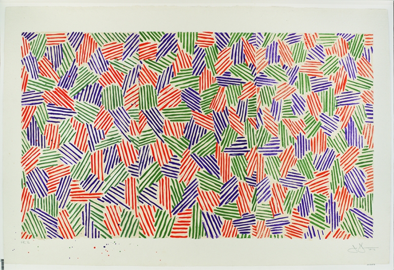
Jasper Johns, Scent, 1976. Lithograph, linocut, and woodcut from four aluminum plates, four linoleum blocks, and four woodblocks on Twinrocker paper
Howardena Pindell’s piece Autobiography: Artemis possesses a meditative quality similar to that of Johns’ Scent, but the inspiration behind her piece has a distinct social and historical weight. The sense of movement in the piece is immediate, almost palpable: bright gold hues and gentle blues are stacked on top of each other with a kind of speed you can sense, even as the work itself is stagnant. Up close, the viewer can just make out the places where the canvas was cut to cast several shapes across the circular form. At some points, Pindell’s technique allows for the paint itself to stretch across these almost imperceptible gaps, tiny fissures in an otherwise bright and seemingly coherent whole.

Howardena Pindell, Autobiography: Artemis, 1986, mixed media on canvas. Image courtesy of Garth Greenan Gallery.
The “dot” motif stems from Pindell’s own experience traveling to the South as a child during the Jim Crow era and noticing that a red dot was placed on the bottom of dishes in many Southern restaurants to separate them from dishes used by white customers. Pindell brings the painful history behind this memory to the surface by capturing its sensory components. “‘Abstraction is like that: it doesn’t have a concrete meaning, but can relate back to signification in the work,” Pindell explains, “like that experience of turning over the cup and seeing the circle, of being marked.” In emphasizing the experiential, Pindell takes a highly individual memory and magnifies it. Pindell’s memory does not have to be “concrete” to be impactful. In fact, her abstract approach and perspective, including her choice to retain and emphasize the childhood perceptions of sight and touch, allows a work based on personal recollection to encompass the larger social implications of what it means to be “marked” in America.
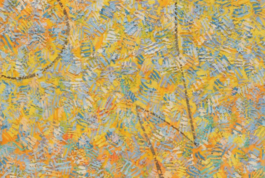
Howardena Pindell, Autobiography: Artemis, 1986, mixed media on canvas. Image courtesy of Garth Greenan Gallery.
While vastly different in their execution, Stephanie Syjuco’s prints Cargo Cults: Cover-Up and Applicant Photos (Migrants) take on a similar phenomenon, sharpening the sloping curves of Pindell’s work into a starker approach to what it means to be “marked.” Syjuco’s inkjet prints are almost unforgivingly angular, making their viewer strain to make sense of their subjects. It is this very process of identification, the metrics our brains flick through in order to categorize another person, that Syjuco seems to want to challenge. Less Is a Bore only features one print in her Cargo Cults: Cover-Up series, which depicts Syjuco embodying common stereotypes within Filipino culture. “Cover-Up,” who stands for the entirety of the series in this exhibition, is Syjuco, covered up to her eyes in colliding lines of fabric. The superimposed gradient works to emphasize the harshness of the two-tone print: Syjuco has purposefully eliminated all nuance in her depictions of what it may mean to be this particular woman, using emblems and markers from within her own culture to produce this stereotype.
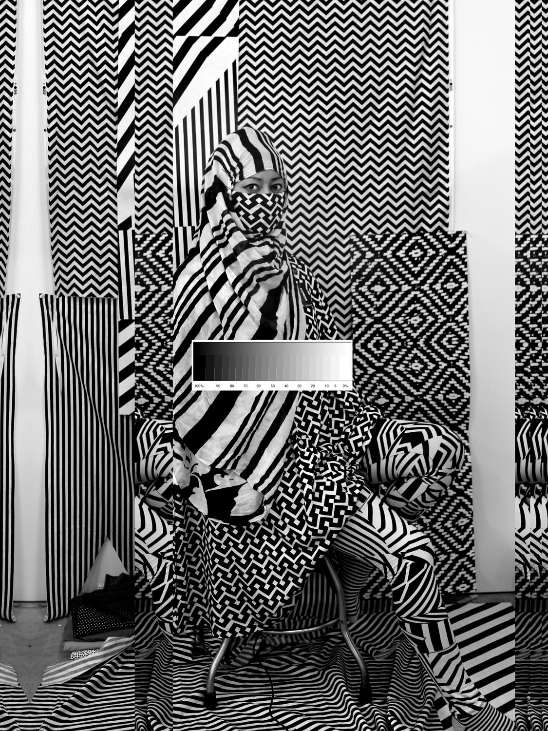
Stephanie Syjuco, Cargo Cults: Cover-Up, 2013-16, pigmented inkjet print. Image courtesy of the artist.
Syjuco pushes her work further by sourcing all of her materials from “fast fashion” retailers. This bold choice (including the full refunds she receives from returning all of the materials after making her prints) seems to heighten the notion of a commodifiable identity: such clothes present a quick, easy, and simplistic way to characterize someone.
The zigs and zags of these prints seem to be Syjuco’s own red dot. Both Pindell and Syjuco redirect the forces threatening to reduce them to almost nothing, channeling them through a sort of repetitive confrontation of these symbolic shapes. Inkjet prints, as Syjuco indicates in her other series Applicant Photos (Migrants), can be easily and rapidly replicated, churning out identical images to whatever capacity necessary. By choosing to convey her messages in this medium, Syjuco is able to embrace the power of identity-as-commodity in her form, while challenging it with the content of her work. In Applicant Photos (Migrants), Syjuco’s face is entirely obscured—the self is unidentifiable, though it is portrayed using the government standard format for identifying who belongs and who doesn’t. Syjuco subverts the kind of subordination that comes with being passively “marked” by using the very channels of identification most often and most easily accessible to assess someone’s status. Questions of citizenship, race, gender, and sexuality that have crowded the modern American conscience reverberate through Syjuco’s daring exploration of agency in identity in her work.

Stephanie Syjuco, Applicant Photos (Migrants), 2013-2018, pigmented inkjet print. Image courtesy of the artist.
I hesitate to unspool a singular, connective thread that draws these impressions together. Robert Venturi, whose wit and insight molds the entirety of the exhibition, argued “for messy vitality over obvious unity,” a phrase I gladly documented and then immediately struggled to truly embody as I encountered each piece. I have an urge to form a neat conclusion, to have things connect—I’m not as comfortable courting “the possibility of a complete lack of meaning” as I would like to be. What I was able to identify was that, despite its clear Maximalist bent, zooming too far out from Less Is a Bore in search of an overarching theme compromises the true focus and power of its pointed abstractionism. I became increasingly comfortable allowing each piece to be its own experience for both the viewer and artist, even as they all swim in the larger soup of “mixing and matching” that drove the creation of this movement. I often find myself looking to conclude with the word “ultimately,” but was happy to find that the nature of the exhibition kicked this crutch away from me. The beauty of Maximalist art, and of Less Is a Bore in particular, is that the apex has yet to be created—the goal is to do more, to do it bigger, and to never stop. Less Is a Bore celebrates these values by capturing the moments that inspired them, granting the viewer an experience that is at once roving and refined, a chance to perch comfortably—though not too comfortably—on the precipice of total sensory overload.
Less Is a Bore will be on view at the ICA/Boston through September 22nd. More information on the ICA and the exhibition can be found here.